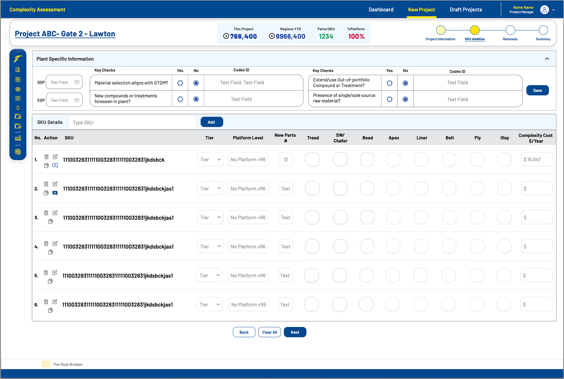
I reimagined the user flow by deeply understanding the needs and pain points of the stakeholders who have been using this system for over a decade. The original tool, while holding data worth lakhs, had grown heavy and difficult to navigate—largely shaped by legacy habits and business-driven decisions rather than user experience. Instead of forcing a complete environment change, I built a compact, structured application that respects familiar workflows while improving clarity and usability. This project was a great reminder that business priorities often take precedence over design ideals and aligning the two thoughtfully is where the real value lies.
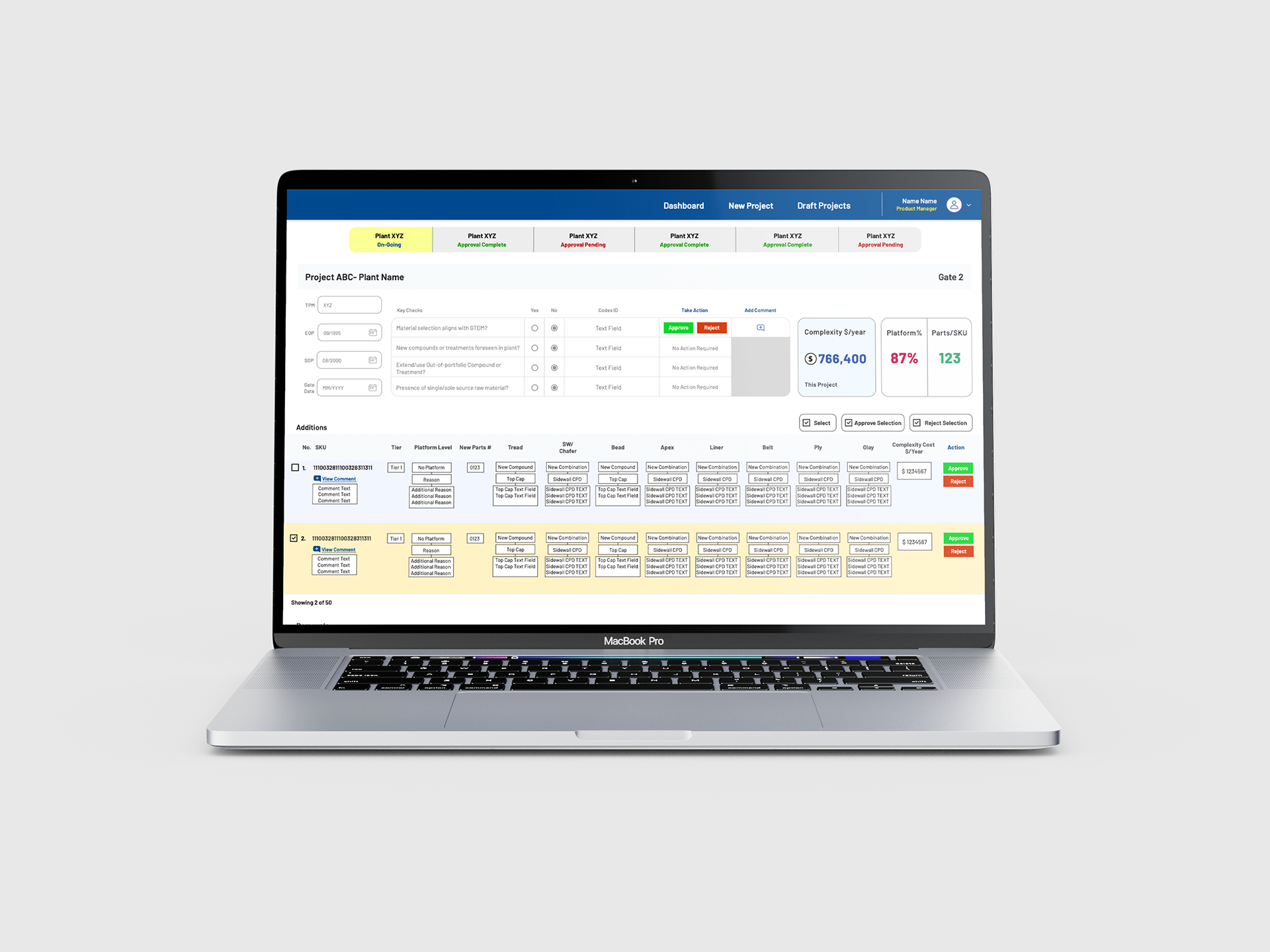
Additionally, I designed dedicated review screens that allow stakeholders to assess data in the hundreds of thousands with minimal effort, simply by scrolling, without excessive clicks or navigation. These screens were built to prioritise speed, clarity, and scalability, making it easy for reviewers to spot patterns and take action at a glance. This approach significantly reduced friction in the review process and was appreciated by the client for its practicality and efficiency.